Buchineko is an adult toy brand. This brand aims to change people's adult toy's impression from a hardcore sexual tool to something casual that you may need in your life. The products also come with an app that enables user to control the toy with ease.
- Establish the brand image that appeals to the target audience.
- The app has a simple and intuitive user flow.
- Create easy-to-understand data visuals for the target audience.
- Convey the feel of the brand image throughout the products.

Kickoff
I took a goal-directed design approach in order to make the design process effectively. I found qualitative research methods to be the most useful, followed by conducting user interview, competitive analysis, usability study, and creating persona hypothesis. I started out by asking myself some initial key questions.

UNDERSTAND USER'S NEEDS
Based on the interview and research that the other team members conducted, I categorised their needs in order to have a better understanding about them. This step was taken to create accurate personas, user story user journey map and problem statement.

Personas


Value Proposition
Based on the persona's needs, I created an affinity diagram to separate the data into groups of tasks which were further categorised by high level goals for improvement in Accessibility, Professional Experience, Cost and Reliability. Recognising the conflicts of interest from each audience allowed me to focus on shaping user goals and how those goals would in-turn also affect the business' goals.

Competitive Audit
I looked at several potential competing brands. They are not direct competitors with Buchineko as their products do not come with the dedicated app, they can still infringe on the business' revenue & popularity. The majority of the features between competitors were very similar, however the main differences that I noticed were:
– Sleek Design vs Cute Design
– Very Simple Controls vs Controls with Many Options
– High-end price vs Affordable price

User Flow Chart
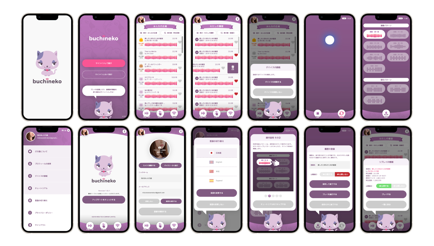
I constructed a user flow of what a basic start to finish journey looks like while playing with their products with the app. This helps me in understanding ways users can interact with the product, as well as allowing me to see navigation through user goals.

Branding
I started working on branding in order to create casual and cute impression to the target. The brand name "Buchineko" (Bicolor Cat) was a fixed thing by the stakeholder, The logo had to be related to "cat". As the "alone time" or "the time with partner" with an adult toy is somewhat fun and extraordinary, a cat in dream/imaginary world as a mascot was my first concept. I started expanding ideas from it to create the Buchineko's branding.


Wireframes and Intreaction
I sketched some wireframes for key screens for the app thinking through the preliminary flow, I reviewed what was necessary, unnecessary , and what areas needed improvement. What the app can do is limited due to the reason the app will be based on the program that's already prepared. So I focused on creating layouts and design that's easy to use for casual users based on the fixed functionalities.
Usability Study
After creating the prototype from low fidelity wireframes, I prepared series of tanks and questionnaires for a usability test. I asked 5 different participants to run through the prepared task in the prototype in hopes of garnering enough feedback to use for the next set of design iterations. Each participant run the same tasks and answers to the same questionnaires. In this way, I can receive various feedbacks for each element that I need a feedback in order to come up with a useful insight.
Insights

Quick access to their regular activities
I found that many users want to access to the most used features - replay their recorded data. It was a right decision that I placed the list of the recorded data in Home screen.

Easy and stable connection
Having difficulty to connect the device and the app or getting interruption due to disconnection from the device would diminish user's interest to the app quickly.

Intuitive Controls
Tapping and swiping gestures on a phone screen feels easy but it turned out it can be challenging if there is no good amount of tutorial.

Enjoyable Interactions
In addition to simple and clear userflow, user would thought it would be fun if screen transitions and system feedback when they tap or swipe the screen are visfblly enjoyable .
High Fidelity Mockups
Branded Landing Page

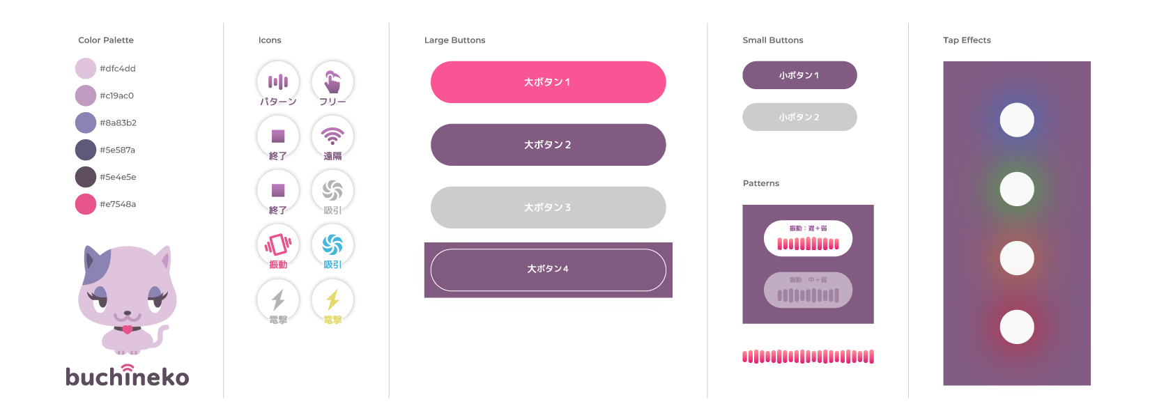
Design System
I expanded the colour palette from the logo earlier to applied to the UIs for the app in order to have a consistent feeling about the brand. The shape of the UIs to be rounded to create the cute feeling. The choice of the font also should align to the other concept. I chose Rounded M Plus font family because it is a cute rounded font that contains a lot Japanese Kanji letters as well as hiragana and katakana at the same time it won't affect the readability and has various font weight.
Takeaways
It was the first time to design entire products - Paper design, digital design, web design and app design. And it's an adult toy brand! I enjoyed the research and design because it is very interesting to know the fact at the same time fun to apply the analysis to the design. Although there were some limitation in creating app, it was a unique experience to think about the specific target for the specific purposes.