Saint Etoile app is a menu app that allows users to browse and order their product with ease. With a simple and clear design and IA, a wide range of users are able to obtain the information they need to make a purchase decision and accomplish their tasks within the app.
- Create easy-to-understand data visuals for the target audience.
- Establish a simple and intuitive user flow.
- Convey the feel of Saint Etoile while remaining functional.
- Provide a seamless & linear purchasing experience.
Kickoff
In this project, I took a goal-directed design approach in order to make the design process effectively. I found qualitative research methods to be the most useful, followed by conducting user interview, competitive analysis, usability study, and creating persona hypothesis. I started out by asking myself some initial key questions.

Understand User's Needs
I conducted user interview to gather users voice from menu apps. I categorised their needs in order to have a better understanding about them. This step was taken to create accurate personas, user story user journey map and problem statement.

Personas


Value Proposition
Based on the persona's needs, I created an affinity diagram to separate the data into groups of tasks which were further categorised by high level goals for improvement in Accessibility, Professional Experience, Cost and Reliability. Recognising the conflicts of interest from each audience allowed me to focus on shaping user goals and how those goals would in-turn also affect the business' goals.

Competitive Audit
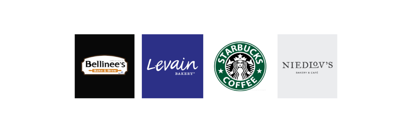
I looked at several potential competing companies, small business to large business. Although none compete directly with Saint Etoile, they can still infringe on the business' revenue & popularity.
The majority of the features between competitors were very similar, however the main differences that I noticed were:
– Easily Accessible vs Hardly Accessible
– Too Many Screens vs Simplified Interaction
– Bright / Distracting Interface vs Minimalistic Interface
User Flow Chart
I constructed a user flow of what a basic start to finish journey looks like while purchasing an item. This helps me in understanding ways users can interact with the product, as well as allowing me to see navigation through user goals.

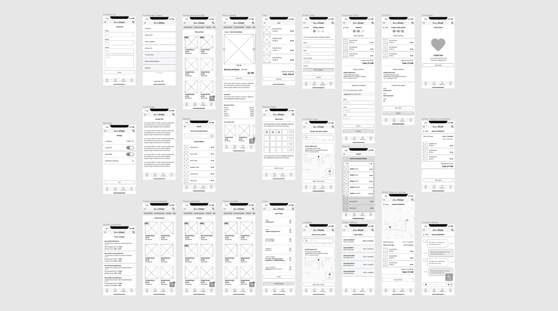
Wireframes and Interactions
After sketching out some wireframes and thinking through the preliminary flow, I reviewed what was necessary, unnecessary , and what areas needed improvement. I spent a lot of our time into this step to make sure I had the finishing touches on the underlying UX before moving onto the visuals.
Usability Study
After creating the prototype from low fidelity wireframes, I prepared series of tanks and questionnaires for a usability test. I asked 7 different participants to run through the prepared task in the prototype in hopes of garnering enough feedback to use for the next set of design iterations.
Each participant run the same tasks and answers to the same questionnaires. In this way, I can receive various feedbacks for each element that I need a feedback in order to come up with a useful insight.
Insights

Overlooked key elements
I found that many users still overlook the key elements like product category navigation or order status even if they have a certain degree of emphasis on them.

More payment options
The majority of users want more payment options in addition to the payment options that they usually use so that they can switch the option when they need.

Quick access to shopping cart
Users want would like to access their shopping cart without having to moving to a separated screen so that they can go back and force between cart and what they are browsing.

Text readability
I found that standard text size is not large enough to read for older users age of 55+. They can still read, but the text constrains their eye heavily and make them feel tired very quickly.
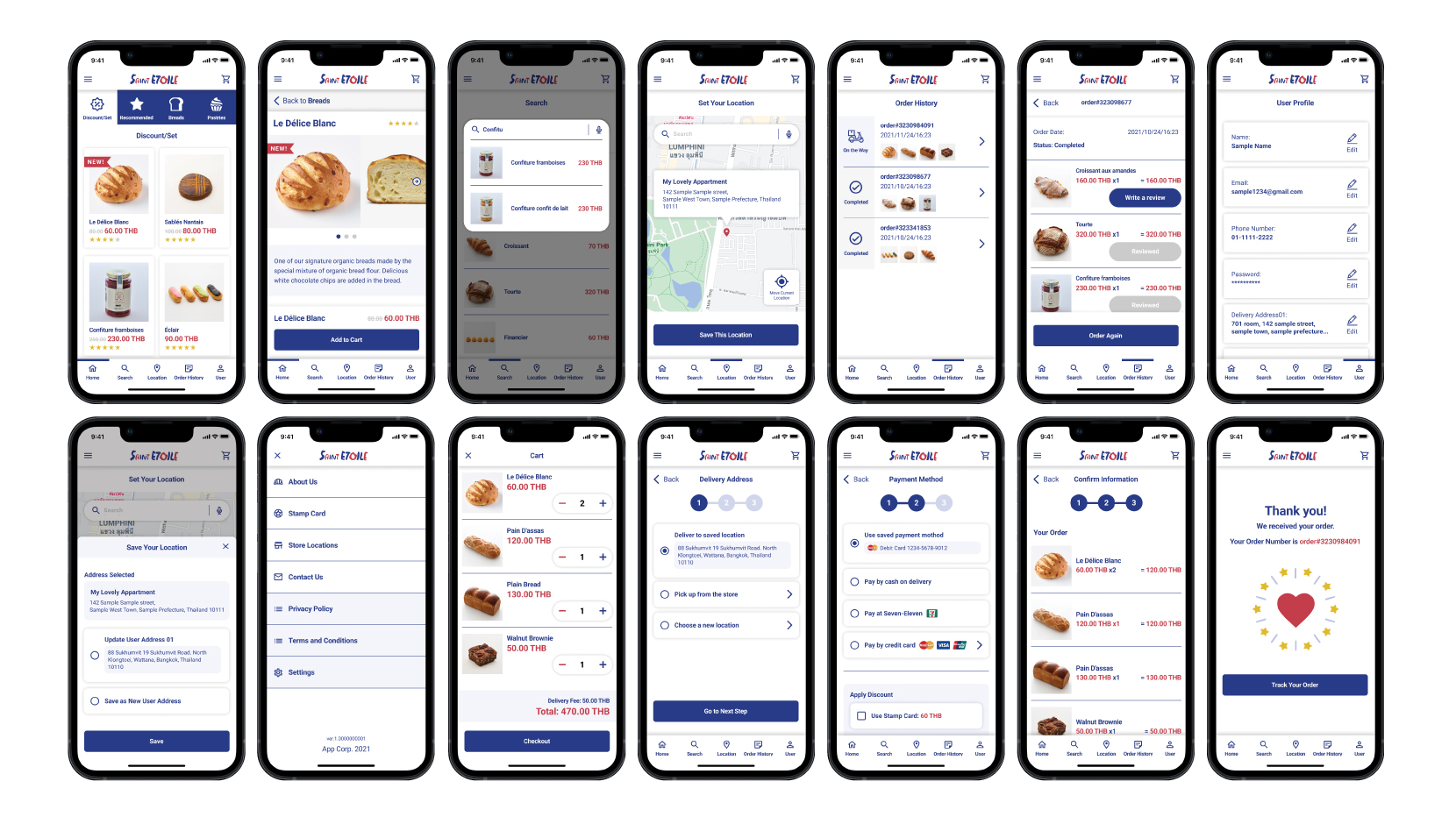
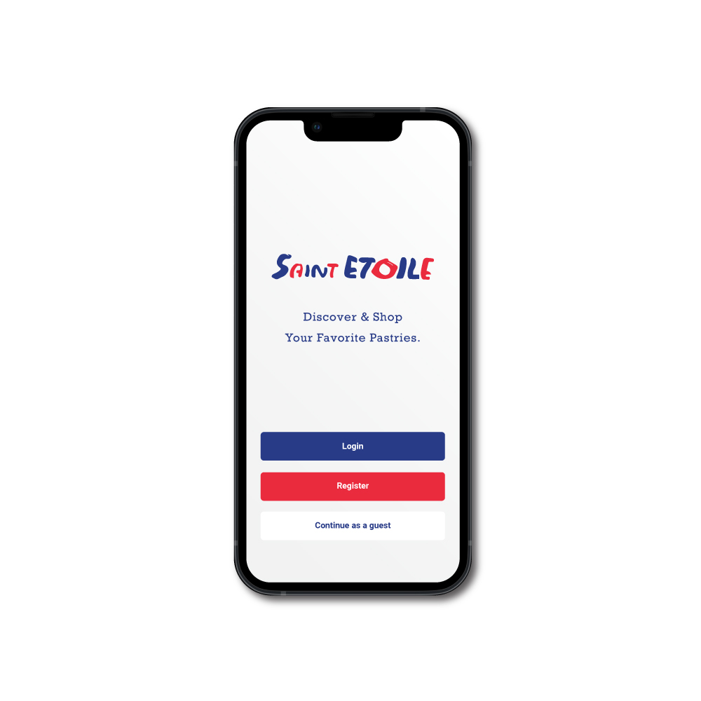
High Fidelity Mockups
Design System
The key colours were taken from their existing brand colours to match with their brand image. I chose supplemental colours as white, light blue and light gray in order to create a clean and sophisticated impression. Used the red colour only to very important elements in the app so that user's attention would be drawn to them effectively. I chose a simple Roboto font that has good range of font weight in order to fit in the layout nicely.

Takeaways
As a Japanese pastry lover, Saint Etoile App is an idea that is near and dear to my heart. I wanted to communicate the importance expressing myself through different creative outlets. This was my first time fully using the goal-directed design process. I can definitely see it being useful in future projects. The idea of honing in on the persona hypothesis creation to help further the goals of not only the user, but also the business is a step that I had taken for granted up for a long time. I learned that designing for the business goals is just a part of it, it is essential that the design is based on user’s need throughoutly in order to create something that really works.
Download Process Book